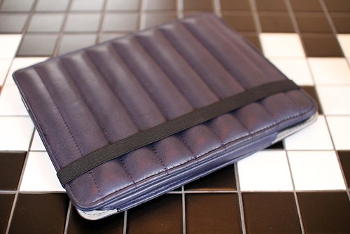
H by Harris for GQ iPad Case
To coincide with the launch of the the
GQ iPad App,
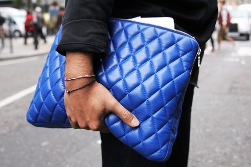
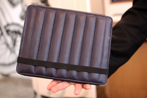
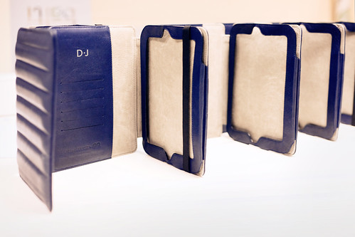
H by Harris has collaborated with the gentleman's monthly to create a limited edition case. It is the perfect match up. Harris' personal need to find a stylish yet practical laptop case has continued to evolve into a thoroughly modern, yet understated luxury luggage brand which is designed and manufactured in the UK. As with all of the carefully crafted accessories that he produces, the exclusive case is an item that fuses function with design. Hand crafted from luxurious Navy hide leather, the interior features contrast grey suede lining, a card holder and space for documents. It turns my indifference towards the machine in to longing. I need an iPad just so I have an excuse to possess this case, to be able to stroke the quilted butter soft hide. However, before rushing off to the Apple store, we sat down with the designer to learn more about the collaboration and the item itself...
A closer look at that butter soft Dallas leather
SS: How did the collaboration with GQ come about?
Harris Elliott: As with most good things, it started with a simple conversation, i was chatting to Robert and Vanessa at GQ about the different projects they were planning regarding the launch of the GQ App.... Then it became obvious that we should try and do something.
SS: What was the initial starting point for the item?
Harris Elliott: Luxury, protection and style. I wanted it to be one of those pieces that had it's own identity.
SS: Why attracted you to designing an ipad case?
Harris Elliott: GQ were launching their iPad app for their October issue. They had released a pilot issue in July which was amazing, everyone I showed the app to, couldn't believe that magazines had reached that stage of digital development. So it made sense to create a new luxe case to commemorate the launch.
SS: How did you go about stamping your take on this accessory?
Harris Elliott: One of the H by Harris trademarks is quilting, we used the quilt so people would know it was an H by Harris design.
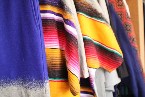
SS: This season marks a shift in your quilted offering. We've all grown accustomed to seeing the diamond quilted (Q1) skin but now we are introduced to the striped quilting. Could you talk us through this introduction?
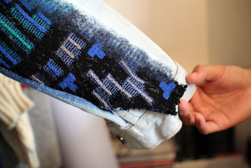
Harris Elliott: Since day one I had planned on introducing new styles and leather/fabric applications. My head is always two steps or a year ahead of reality. So AW11 became the time to introduce the stripe. Inspired by the shoulder padding on old motorcycle jackets, this style is very popular with boys, so it was the obvious choice for the GQ man.
SS: Could you talk us through some of the technical processes and people involved in making the case?
Harris Elliott: Robert Johnston (GQ features editor) and myself discussed the features that we felt an iPad case for a guy should have. So a space for cards and possibly a passport, seemed like a nice touch.
The leather we used is called Dallas, a butter soft hide with a slight creamy texture. Unlike nappas that H by Harris uses a lot, you can see and feel the grain of the leather, so the luxe look is in shape and form.
We worked with a sign writer, and an old school book binders to produce hand printed cards, with double foil blocking.
Of course there were the artisans that put it together....
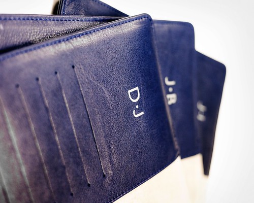
A closer look at the personalisation
SS: Did you encounter any problems? How were they resolved?
Harris Elliott: The initial problem was time, we had two months to produce the cases from start to delivery...you normally have much longer than that from sketch to end user. We had a week to produce the initial prototype which was stressy as the first proto had to be almost spot on.... Thankfully it was.
SS: How would you describe the finished piece in your own words?
Harris Elliott: Contemporary luxury, I can always tell how good something is, when people instantly comment on a product, pick it up and caress it before being asked their opinion.
SS: I notice a bit of personalisation on some of the cases, is this a new way forward for H by Harris?
Harris Elliott: Definitely, it's something we've planned to introduce for a while. In the past we have created metal plates and embossed customers names into the leather labels for them. Scriptwriting takes it to the next level, it makes the item completely exclusive, because of the hand craft nature, therefore increasing the personal value that a customer places on their purchase.
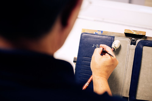
We work with an amazing sign writer who hand paints typography for art installations. It's been a pleasure working with him.
The sign writer in action.
----------
A limited number of cases will soon be available on the wonderfully revamped
H by Harris site. Each case can be hand personalised by the script writer.