Showing posts with label Menswear Day. Show all posts

Unpicking the seams: Shaun Samson AW11

Unpicking_Shaun_FeatureButton_

Remarkably, this season will be MAN’s thirteenth season at London Fashion Week. Now, we should all know by now that the talent showcase is all about heralding what’s new in menswear but this lineup is one of the most exciting to date. For the SS12 roster, Martine Rose is joined by two newcomers, Matthew Miller and Shaun Samson. Both newbies are deservedly winning plaudits, competitions and buyers for their style and innovative garment techniques. In today's piece I'd like to focus on Shaun Samson's needle punch felting technique.

The International Talent Support (ITS) has been a platform for emerging designers from all around the globe. This year’s stand out was from the California born and now London based designer Samson. He only graduated from the MA course at Central Saint Martins back in February but his modern sportswear stole the show. Sponsored by Woolrich, his seamless fabric manipulation saw chunky knitwear, denim and wool all fuse harmoniously together in oversized t shirts, cigarette trousers and accessories. Samson might have been studying various forms of fashion design for almost a decade but he is ready to take centre stage at London Fashion Week. Before he does, I'd like to learn a little bit more about his technique. Here we sit down with the design talent and chat through his design process before taking a closer look at his craft...

CSM_11_MA_2221
CSM MA shot thanks to catwalking.com

SS: What first drew you to the effect of needle punch felting?
Shaun Samson: I had known about needle punch felting for a while, I can't remember the first time I encountered it but I had it my head for some time but didn't start working on it until my MA. As I played around with the technique, I started off with solids and then found old garments and through a process of experimentation, I soon began to understand what worked best. My earliest samples show a more obvious process, where you can see one fabric sitting on another but I wanted to make it more subtle, cooler. I paired them with woven, knits and cashmeres, experimenting with weights. Finally, I decided the best way to show off the technique was to have a wooly fabric with a linen because the fuzzy fibres of the knit help it to mingle. From there I came up with a fabric and colour story and it is here that I first contacted Woolrich with 'Hey, you're an American company and I'm an American student living in London, let's show show them what we can do.'

SS: How was the working relationship with Woolrich?
Shaun Samson: They were so responsive and helpful. Straight off, they sent me a stack of archive fabric examples. It was great to be able to go through everything and immerse myself in the variety of plaids. There was one fabric that I needed to be sent overnight and I pensively asked them, didn't hear anything and thought I had soured the relationship with my excessive demands but low and behold, it arrived the next day. They were just so nice to work with and helped me so much. From this point on it was just a case of building the collection.

SS: Is it a partnership that you'd like to continue?
Shaun Samson: I hope so. I'm just afraid of over using it but I'm keen to slowly build on the relationship in the coming seasons and beyond. I'm so happy that a company liked Woolrich believed in me and supported me as much as they did. When I first approached them I showed them samples of the technique I had in mind but

SS: Needle punch felting is certainly a labour intensive process. Were they any other difficulties that you encountered?
Shaun Samson: This process is like embroidery, you have needles going in and out the fabric until it is done. There is no quick, or short cut way of doing it. To do it, I feed it in to the machine on the reverse so there is no way of knowing exactly what it will look like until I've taken it out of the machine and turn it forward. There is a lot of experimentation while I try and figure out the process and each piece will be subtly different. When you're introducing thicker knits, the process has to be slowed down even further because there's a significant chance of breaking needles. I also had this problem when I was felting denim, it is just a matter of understanding the fabrics that you are working with and changing elements of the process accordingly so that it looks the best it can.

SS: How long does it take to make one piece?
Shaun Samson: The felting process itself takes around three to four hours. To finish the piece, the entire process is done by hand. Hems and linings are tacked down by hand. So to complete a whole piece it takes around a day in total but that's when I dedicate an entire day to it. I enjoy the process and the more I do it, the more acquainted I get and ultimately the better I get.

SS: As production grows, would you pass this process on to a factory?
Shaun Samson: There are some amazing factories out there. I've been told it can be done but I've not seen it work well with pattern fabrics, only solid fabrics as yet. With the pattern fabric you have to ensure that the pattern continues and matches exactly. If it is out, even by the smallest of margins, it gets punched and the appearance is crooked. The lines have to match precisely. This is where the advantages of doing it by hand come in because you can really follow the needle. I'm sure a machine exists that could replicate it but I've just not encountered it yet.

SS: The collection explores an over sized silhouette. Now, I've seen the t shirts in particular referred to as many things, would you call them t shirts?
Shaun Samson: That's how I viewed what I made from my MA collection, they were oversized t shirts rather than tunic tops or man dresses. It is nice that people think that t shirt is new but I've been wearing them large like this since I was a little kid.
----------

As Samson talked me through his award winning MA collection he brought the described techniques and creative processes to life by flicking through his sketchbook and rifling through his draws of fabrics. To attempt to replicate this luxury, I'd like to share a selection of studio shots accompanied by the designer's own musings....

IMG_7006
"I was drawn to Woolrich even before I knew that I'd be working with them. I've been a fan for so long" 
His sketchbook contains catalogue shots and a cocktail of fabric swatches.

IMG_7009
Woolrich catalogue images are cut and sewn together like Frankenstein's monster.

IMG_6999
"Woolrich sent over an archive of tartans and plaids to choose from"
A selection of Woolrich tartans

IMG_7051
Samson's sewing machine

IMG_6985
"My earliest samples show a more obvious process, where you can see one fabric sitting on another but I wanted to make it more subtle, cooler."


IMG_6986
"I paired them with woven, knits and cashmeres, experimenting with weights."

IMG_6976
"After a process of experimentation with the needle felting technique, I decided the best way to show off the technique was to have a wooly fabric with a linen because the fuzzy fibres of the knit help it to mingle."

IMG_7011
"Initially, my first drawings concentrated on button up shirts and coats but along the way I opted to simplify them to make a stronger statement."

IMG_7014
The Statement.

IMG_7016
A work in progress

IMG_7017
...and another.

IMG_7020
The lineup

IMG_6989
A close up the mingled fibres of the tartan and linen.

IMG_7002
A heady mix of chunky knit and wool.
----------

Whilst so many young designers explore fabric manipulations in their work, it is rarely achieved with the finesse and skill that can be seen throughout this collection. Having taken a close look at his process, all that's left is to showcase his look book imagery (and impatiently wait for Menswear Day)...


Shaun_Samson_AW11_ 8148x
Shaun_Samson_AW11_ 7781x
Shaun_Samson_AW11_ 7582x
Shaun_Samson_AW11_ 7971x
Shaun_Samson_AW11_ 7480xx
Look book credits
Art Direction by Rob Meyers and photography by Pelle Crepin.
----------

During my studio visit, in addition to finalising his plans for MAN, Samson was collating and packing off a number of key AW11 pieces for his first store. The buyer of Cement in Japan was quick off the mark and Samson's much coveted designs will soon be available. Following his London Fashion Week show, I'm in little doubt that buyers closer to home will soon be picking up this young talent. We'll certainly be hearing a lot more from Shaun Samson. Roll on Menswear Day.

Illustrating Menswear Day SS11: E. Tautz

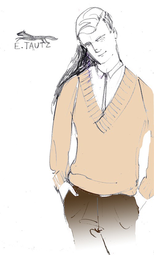
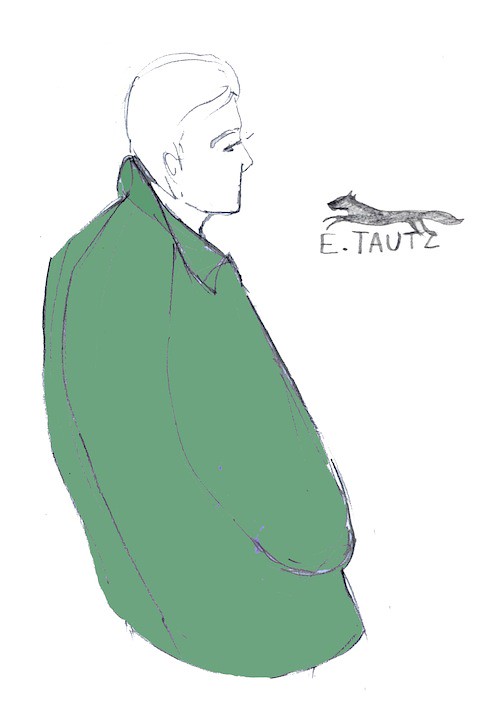
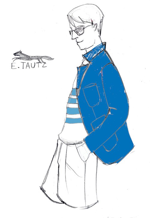
Two weeks have passed since Menswear Day but there is still so much left unsaid. Presentations, catwalk shows and film screenings all celebrated the exciting diversity of menswear design talent which uniquely exists in this capital of ours. It was exciting to see stalwarts of Savile Row sit so comfortably alongside high street regulars, established designers and exciting new talent alike. The entire schedule helped cause a sartorial stir or two whilst collectively flying the flag of menswear and tiring me out in the process. One of the most enjoyable experiences was the salon style presentation at E. Tautz in the Navy Board Rooms. It was perfectly fitting of this particular Savile Row tailoring house: a highly intimate, personal service whereby Patrick Grant introduced each look in a wonderfully personal and engaging manner. 

As you should all know by now, E. Tautz is a label which champions the notion of dressing properly and of men taking pride in what they wear. It creates simple cutting paired with bold accents of colour and pattern - cloths with scale and texture; big checks, fine flannels, and stripes. For SS11 they continued to present a modern and elegant aesthetic while fondly glancing back in time. They've cut their cloth with a modish sharpness in crisp wool fresco's, hopsacks in wool and silk, a selection of crisp linens and stiff drills. Last summer, Patrick an his team were inspired by the idea of the Englishmen on holiday but for this season they looked closer to home. There are hints of Brighton Rock with the clipped drainpipes, full collared button downs, pin tight knots and harrington coats. Both Gordon Richardson and Patrick Grant have seemingly been inspired by Greene's novel. While a stripe or two remind us of the British seaside in the height of summer. The collection manages to encapsulate all that is charming about spending the warmer months by the English coast. For me this collection celebrates a quiet but stylish summer in Blighty where you can 99s, sandcastles, beach huts, surprisingly chilly seas and so on. Of course there are moments where a North wind might blow a chill your way but Grant has taken that in to account and offers a navy fresco wool trench teamed with a cobalt blue sea island t-shirt and denim blue trousers. Just lovely. Perhaps I'm biased because I've spent so much time by the English coast but Lauren Macaulay manages to capture the essence of collection with her illustrations... 

Illustrations by Lauren Macaulay

One of Patrick Grant's main reasons for relaunching E Tautz was because he felt that there was nobody creating beautiful, chic, English menswear. He identified a desire for something handmade, beautifully cut and with English cloth at its heart. The label offers simple tailoring with a little something extra added, a bit of pomp, a bit of colour. This collection once again demonstrates chic menswear but with a sense of Englishness that has been lost over the years. The revived house strives to make stylish clothes to which a wardrobe can be built from. Grant's ultimate aim for E Tautz is to secure a position close to the one it held in the 1910s, when Europe and America knew E. Tautz as England's finest sporting tailor and their salons in London and Paris were dressing the world’s most elegant men. With each season, Grant edges closer to his goal.

Illustrating Menswear Day SS11: James Long

For SS11, James Long presents a hallucinogenic inducing assortment of psychedelic rebels, rich in colour and texture. Referencing iconic drifter and anti hero films such as Midnight Cowboys and My own Private Idaho whilst mixing in recent experiences at Woodstock, the collection celebrates a relaxed time of psychedelic living. Long offers a bright and bold collection, where the man who wears it stands alone on a deserted stretch on a highway, nonchalantly flicking out his thumb for a ride.

Long's juxtaposition of references and fabrics gives us a collection that is both sharp and clean, yet loose and elongated. Realistic but at the same time colourful, creative and almost dreamlike. Texture is always an important facet of Long's creations and there are a number of items here that begged to be stroked as they hitchhiked their way past on the catwalk. The abundance of fabric patch worked together works as a representation of the myriad of different youth cultures that make up the character of the collection. For example, we see trippy knitted patchwork in silver grey wools worn over acid bright silk and chiffon tailored shirts, paired with cobalt blue cotton and lightweight indigo mohair. Elsewhere we see hints of liquorice and tobacco coloured leathers against desert dried denim. This cocktail of fabrics and textures lead to a hazy state of mind and feeling for SS11. Now, I have spent a significant amount of time admiring the backstage shots over on Dazed Digital following Menswear Day but even they could not fully translate the true beauty of the collection. Thankfully for us, Lauren Macaulay has spent the day with paintbrush in hand and the resulting artwork manages to capture the collections wondrous sense of texture. Light mohair, trippy patchwork knitwear and acid bright silk shirts brought to life by watercolours.


Illustrations by Lauren Macaulay

Illustrating Menswear Day SS11: Topman Design

Showcased in the beautiful surroundings of the Royal Opera House, Topman Design's SS11 collection took its inspiration from the bustling backstreets of Brighton. Richardson and his design team looked to the varied shop fronts and the pieces are influenced by the bounty of vinyl and vintage stores that can be found behind the facade of this classic British seaside town. The result is a collection with duality, think Brighton Rock and Quadraphenia. Super sharp tailoring combined with attention grabbing printed shirts on the one side and a selection of colourful casual wear on the other.

Now, I have to confess that there were the odd looks that left myself and Lauren scratching our heads (the high waisted belted shorts were of particular concern) but the eclectic colour palette, ranging from apple green to dark burgundy which featured throughout playful knitted sweaters and light coats were something to get excited over. The real highlight was seeing graphics of old vinyl, Polaroid cameras and foxes applied to the bold knitwear. Everyone wants a fox on their jumper, don't they?For those of you who are unsure, let Lauren Macaulay's illustrations persuade you.


Illustrations by Lauren Macaulay

Illustrating Menswear Day SS11: Christopher Shannon

Christopher Shannon's SS11 collection references a feeling that is all too familiar. Inspired by the nostalgic feeling of never getting to go anywhere on holiday. Having waved off countless colleagues and friends as they escape the city for a few days in the sun I have instead spent the holiday season beavering away in the capital. In the midst of my own cabin fever I can truly appreciate Shannon's wanderlust of trips he is yet to take.

Holiday and festival snaps taken by friends and family combined with images from his parent's adventure to Nairobi all form the backdrop. Subtle nods to Passa Passa raggae videos, knock off ethnic tourist trinkets and raggae artist Dillinger collide to create pieces rich in depth and texture. Shannon's signature graphic prints and bold colour palette are omnipresent, be it through his experiments with camo prints on jersey and denim or the juxtaposition of optic white against sunshine friendly pastel shades. As the crowned Prince of London sportswear, the collection showcases breathable fabrics and nylons against crisp cotton shirts, while mesh shorts sit over dyed denim. Multi-textured knitwear in odd proportions sits alongside block coloured anoraks and the latest incarnation of the hugely popular Eastpak collaboration. Lauren Macaulay once again picks out everything that caught my eye during the show and brings back a real sense of the show with her illustrations...

Illustrations by Lauren Macaulay

Unpicking the seams of Menswear Day...Matthew Miller

Just as the sun was setting on 2009 we caught up with one of the most exciting design talents to emerge from the Graduate shows of June that year. As we all know by now the RCA's MA graduate show is one of the best (and most exciting) places to discover the fashion stars of the future, we found such a star in Matthew Miller. During his time at the prestigious college he won a number of awards and competitions and has worked with brands such as Umbro, Brioni and Thierry Mugler. In his standout graduate collection, Miller explored notions of masculinity with a jovial as he explored how a young man deals with the possibility of his own death after hearing the news that he will soon be sent to war. The collection saw him balance sharp tailoring and menswear staples with humour as he experimented with laser cut polka dot bombs, dancing skeleton pique bibs, cute cable knitted skulls, to name but a few interesting details. We couldn't wait to see what this young talent did next but thankfully we didn't have to wait long because he was soon added to the London Fashion Week Menswear schedule...

A look from Matthew Miller's AW10 as shot by the talented folks at Fashion156.

For me, nothing represents the diversity more than Fashion East's Menswear Installations and the latest crop did not disappoint. One of the real highlights of the space was Matthew Miller's smile inducing tailoring. Ever since the day itself we have been itching to do a more in depth feature on this young talent and are fortunate enough to offer a glimpse in to the designer's mood board, sketchbook and finished pieces.

The Inspiration
As mentioned in the previous post, we were both fans of Another's First Look series because it offered glimpses at some of my favourite labels mood boards while sharing the designer's inspirations, wants and desires. This type of coverage taps in to our inquisitive nature and really helps see the collections in a new, brighter and altogether more agreeable and understanding light light. With this in mind we just had to see the key images behind Miller's Plasticine Dreams Become Killing Machines...

Matthew Miller's mood board for AW10


The Concept...
We have been meaning to talk about the interplay between the social constructs of masculinity on men's fashion and style in a series of posts for some time now but however many posts we draft, we ultimately do not know quite where to begin. Thankfully a number of our favourite designers are posing the questions for us and the resulting collections are full of variety and interest. Building upon the techniques explored during his time as a student from tailoring to laser cutting, Miller's inspiration for his on-going work continues to look at the way in which society has been conditioned in its perception of masculinity, forming a narrative to his designs...

"Man/Boys Masculinity is under a barrage of social conditioning. Conditioning that wants Masculinity to self destruct. As children boys are constantly given objects that symbolise destruction war and death, they are taught how to kill mame and murder through the art of game. Is it any wonder these boys destroy society and themselves! The collection is a symbolic representation of these man boys! Unwilling to become men, conditioning to destroy each other with there toys of war." Matthew Miller.

Technical Drawings
As fashion consumers and obsessives, we rarely get the opportunity to see anything other than the finished look but as bloggers we are always interested to understand how the designer's sketches become reality. To help us see through the studio door and in to the sketchbook, Matthew sent through a number of key technical drawings...


The Look Book...
In addition to the technical drawings and mood board, Matthew has sent through the first round of images of his AW10 look book which we can exclusively share with you now. The collection itself is inherently British. Primarily in the sense that it is Irony in the form of Garments. The whole collection was supposed to look fun, and that’s what comes across, but upon closer inspection, you can see all the fun elements have much darker undertones...


The Video...
This short film directed by Alex Johns accompanies Matthew Miller's Fashion East menswear collection. It premiered at Somerset House as part of London Fashion Week 2010 but we were the day was so hectic that we didn't really get a chance to view it properly. Now we can...


Season after season Menswear Day gets more interesting. For Aw10 it was particularly exciting to see Savile Row sit comfortably alongside the high street, more established designers and exciting new talent. With the emergence of designers like Matthew Miller, the future of menswear design in the capital is undoubtedly bright.

Unpicking the seams of Menswear Day... Sibling

Sibling Aw10. Social Zombie Crew. Photo by Thomas Giddings

A few weeks may have passed since Menswear Day but our collective blogging mind is still full to the rafters with thoughts on the collections we discovered on that busy, busy day. For us, nothing represents the diversity of menswear design talent in the capital more than Fashion East's Menswear Installations and the latest crop did not disappoint. One of the real highlights of the day was walking around the East Wing of Somerset House uncovering the beautiful alongside the weird and wonderful. The bold and progressive knitwear label Sibling showcased both of these virtues and more. For Aw10 Sibling take us on a creepy journey for their fourth collection. Inside Somerset House's East Wing we were led down the staircase, round the corner and through the door into Dr Frankenstein’s laboratory. The label is a collaboration between Joe Bates, Sid Bryan and Cozette McCreery and it really is all for one and one for all. The trio bring with them a strong heritage of experience with top name designers and have added a sense of humour and wit to the wonderful craft of knitwear. We've been meaning to catch up with the design trio for some time and jumped at the chance to do just that while learning more about their hammer horror laboratory. Here we talk to the them about balancing the craft of knitting with humour, here about the design dynamic of the brand, the importance of collaboration and their hopes for the future...

Pixelated Frankenstein Crew. Photo by Thomas Giddings.

SS: Between you, you have worked with (among others) Alexander McQueen, Giles Deacon, Lanvin, Jonathan Saunders and Bella Freud. What have these experiences taught you?
Sibling: Well the experiences we have had collectively have naturally all shaped the existence of Sibling. Some are good, some are bad but all are to be learnt from, the main one being: don’t be afraid to go after what you want!

SS: What were your inspirations, your dreams and the driving catalyst behind Sibling?
Sibling: We are inspired by lots of different subjects as well as what is happening all around us which is no different to anyone else. We are really good friends so will chat about all kinds of stuff over tea and biscuits which may or may not turn into something. The driving catalyst is always to produce something that we are proud of, that makes us and hopefully others smile

Scary Fairisle V neck and tank top. Photo by Thomas Giddings.

SS: What does Sibling mean to you?
Sid: KNITTING – what I do best.
Joe: Fun
Cozette: Freedom

SS: What were the first and last items that you designed under the Sibling name?
Sibling: The very first was the Ram’s Head sweater (sweater… it’s more like a sculpture) for stylist Jane How and the last would be the Knit Monster for Collection Four. Both pieces have had more press than Jordan.

Scary Fairisle v neck tank top in black and white. Photo by Thomas Giddings.

SS: Talk us through the dynamic of the brand. How do the three of you work together?
Sibling: At the beginning of a collection Joe has ideas, Sid says no, Cozette says yes, Sid then says yes about something Cozette doesn’t like and all 3 of us then have more ideas… all of which we hate… or love. Sid then swatches and this could lead to something else, even to the dustbin… and on it goes. There are no properly defined titles for any of us: our characters are very similar in that ‘if it needs doing do it’ way.

SS: Hand craftsmanship is obviously a key facet of the brand. Everything is crafted and the pieces are ultimately a labour of love. Is this what makes knitwear so special to you?
Sibling: We are very lucky to be making a product that we enjoy and yes love. It’s nice that you pick up on that. All three of us have always been obsessed with knitwear throughout our lives. It’s funny when we are interviewed about our childhood or teenage wardrobes because 99% of the time the things we are most fond of have been knitted. That may make us sound weird!

Scary Fairisle scarf. Photo by Thomas Giddings.

SS: I love the balance you strike between the obvious humour of the pieces and the craftsmanship behind them. For your fourth collection you take us on a creepy journey to Frankenstein's laboratory and sees you unveil your Scare-Isle knits, pixellated Frankenstein crews and the motley silhouette. Does this balancing act come easy to you as a design trio?
Sibling: Sibling is all about humour in a very English way that may come across as being a bit silly at times. And we do get silly in our gang, that’s what life is all about isn’t it? We’ll leave those moody grey V-necks to others thank you very much because we are just not that good at it. We giggle way too much.

SS: You are pushing the boundaries of knitwear to create total looks, for example top-to-toe cashmere Scare-isle knit, complete with Long Johns and a knitted raffia-Mohican Balaclava, demonstrating that there is so much more to graphic knitwear than merely sweaters. You are making men's knitwear exciting. How does it feel to have given it a much needed knitted clad slap to wake it up?
Sibling: Knit Monster was great fun to make and yes it is the first time we have ever done a ‘total look’. Frankly we have been fighting against producing a knitted trouser since the start but only because they just never sat right within the previous collections. Here it seemed very very right. We’d been looking at lots of tribal images of people totally covered in paint and fully constructed jumpsuits as well as kid’s Halloween costumes and just went for it. We could have stopped at the balaclava, crew and Long Johns but decided that Knit Monster needed a Puffa. It took a life of it’s own. Total nonsense but it works, this we know because of the chaos he (yes he) has caused since. It’s lovely to have had such a reaction.

Scary Fairisle Hand Knit Jacket. Photo by Thomas Giddings.

SS: Have you got any anecdotes of making the collection that you can share?
Sibling: Oh we only share amongst ourselves! Anything interesting we can’t share, Sibling oath and all that.

SS: Were you able to see any other collections during Menswear Day? If so, who were your favourites?
Sibling: This season the menswear day we felt really came into its own. The quality and style of the collections moved away from club kids and that homemade whacky London trendyness which just makes us groan. Favourites would be Lou Dalton, Carolyn Massey, the shows at Savile Row, James Long… oh God between the 3 of us we’ll just list the entire schedule..! Honestly though it was a very strong day, one we were very happy to be part of.

Collaboration with Will Broome. Beware Hairy Hands. Photo by Thomas Giddings.

SS: As part of FashionEast/MAN exhibition you presented a short film that saw you collaborate with both This is Real Art and COY! and Spider and Flies. How important is collaboration to the label? Who would you love to collaborate with in the future?
Sibling: Collaboration is really important, it’s like an extension of how we 3 work anyway: bouncing ideas off one another. And it’s been really successful, the Noah Skull Breton for example sold out in a store in Japan in less than three weeks. It’s been great working with This Is Real Art as they have really upped the anti with our films. The film they produced for Collection 3 literally hit every blog going. It was like a viral PR campaign. Where next? Good question. No idea. What about Shreddies.. now there is a tie-in that would work!

SS: How do you see the brand developing over the next couple of years?
Sibling: We are relatively a new brand and still finding our feet, our plan was to take our time and to stick around. That still is our plan. Tortoise rather than the hare (Mr Hare… we like his shoes too..)

Scary Fairisle Hand Knit Jacket. Photo by Thomas Giddings.

SS: If you could go back in time and experience any moment in style or fashion movement, what would it be?
Sid: I would love to have experienced the 1920s. I have a romanticized and stereotypical vision of being permanently dressed in a dinner suit and lounging around in smoke filled wood paneled London clubs with Inspector Poirot.
Joe: I have a very rose tinted view of male homo culture between the wars. I know that the reality was hateful and dangerous but I can’t help but think of that era and picture well groomed be suited men dancing together surrounded by rouged queens.
Cozette: I would be a proper punk, well a non-political version of a proper punk. An improper one? Because of my age by the time punk hit the posh girls of Woldingham my Miss Selfridges version was rather watered down and consisted of wearing Boots Country Born hair gel and a few studded wristbands to Catherham Youth Club. If I did it now I’d want to be an expensive Givenchy or Demeulemeester one. Again the politics go out the window. I’d be the shallowest punk on the planet.

SS: Finally, would you be able to share a few address book recommendations to our readers (hairdressers, tailors, cafes…anything you like really) which we will duly add to our map?
Sid: Hervia Bazaar - 40 spring gardens, Manchester, m2 1en.
Joe: The City Cobbler, 215 city road. EC1V 1JN
Cozette: M Goldstein on Hackney Road for clothing and artifacts. Ottolenghi (Islington or Westbourne Grove) for passion fruit meringues. Solange Azagury Partridge for gothic jewels. Jeanette’s on Club Row for Richard Nicoll, James Long etc. Artworld’s Book Shop (Rivington St) and Donlon Books, Cambrige Heath Rd.

Social Zombie Scarf. Photo by Thomas Giddings.